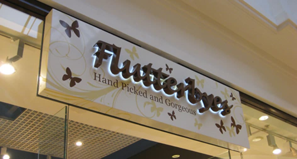
Every successful bricks and mortar retail business starts with good signage. Retail signage is a fool-proof way of getting people to notice your business, drive footfall and ultimately boost sales. When designed and installed correctly, your retail signage can convey the right message and the right image to your potential customers.
Ultimately your sign can be the difference between someone wandering into your shop or not. Signs come in various shapes and sizes and can serve many different purposes. With that in mind, let’s go through four of the most significant types of retail signage that you need to consider.
The Four Types Of Signage You Should Not Ignore
1. Exterior signage
This is the most important physical type of signage as it is the first thing that attracts the customers to walk in the door. They say that the first impression lasts, so to make a great one with your potential customers, make sure that you invest in quality signage that can appeal to your market.
Your outdoor signage should simply introduce your business while drawing in customers and making them feel that there is something desirable for them inside the store. Effective signage can convince passers-by that your business is worth checking out. It should also immediately convey the experience they can expect to have as they walk in the door of your establishment. A lot of this comes down to your logo and branding, which should convey your business’s personality through the use of colour as well as shapes and font.
Strategically place your signage where it is most visible to walk-by and drive-by traffic. Also, consider the weather when putting up external signage. The structure of good external signage needs to be robust, wind resistant, durable, and waterproof, so choose signage that is durable enough to last for years whatever the weather.
Examples of exterior signage:
- Pavement signs
- Shop fascia signs
- Projection signs
2. Informational signage
Also known as wayfinding or directional signages, these type of signs are usually placed inside an establishment to help customers easily navigate on their own. Informational signages are all about providing ease and basic information to your customers.
Simply put, it tells customers where to go or where to find the items they came in for. For example, location headers are placed to show sections within the store such as footwear, accessories, womenswear, etc. To accomplish this goal, your directional signage should feature clear and easy-to-read text.
Having large, bold fonts can also make it easier for customers to understand the message within a split-second glance. Putting up informational signages will not only benefit your customers but will also help your store’s internal structure become more organised.
It’s important that you create brand consistency, so make sure your informational signage is designed to meet all your brand style guidelines, utilising the same fonts, colours and design quirks.
Examples of informational signage:
- Menu light boxes
- Brand header light box signs
- Store directory light box signs
3. Persuasive signage
Persuasive signage is also called promotional signage as this type of sign usually advertises a particular product or promotion. It makes use of attractive imagery and creative sales copy to draw in customers.
Persuasive signs or displays’ main goal is to influence customer flow and interest with otherwise unnoticed products. These are signs that showcase ordinary product and turn them into a popular “hidden gem”.
Putting up persuasive signages provide retailers with an opportunity to promote specific details of seasonal, new, or featured products. Effective persuasive signage should be eye-catching and witty to help boost sales, increase product value, and improve brand awareness. The use of bold colours and large fonts will serve you well here.
Examples of persuasive signage:
- Poster display light boxes
- Digital advertising screens
4. Mats or floor graphics
Whilst the purpose of floor mats is to remove dirt from the soles of your shoes, it can also double up as effective marketing signage. The same goes for any floor based signage. It’s amazing how often the floor is overlooked but combined with the right shop layout, can offer up a huge canvas onto which your logo or useful information can be inscribed.
Whether you opt to use the shop floor for branding or as informational signage (such as directions to various departments, checkouts, etc), it also provides an opportunity to optimise space within your store.
Mats or floor graphics as signage are usually seen in shopping malls, large department stores, museums, universities or campuses, hospitals, events and exhibitions. That’s not to say you can’t make good use of floor signage, whatever the size of your retail store.
Best Practice In Retail Signage
I want to end with a few top tips on creating retail signage. These might seem obvious but you’d be surprised how often one or more is overlooked or just ignored.
- The message should be simple. As long as you want your message to be concise and detailed as possible, you should never put in too much information because it will end up being ignored. Keep the 5-second rule in mind where people should be able to understand the message of the signage in less than 5 seconds, otherwise, it is too complicated.
- The punch line matters. Writing a headline text in your customised signage will help you keep it concise and simple. Your custom sign should have the following: an effective headline, a brief explanatory text and a call-to-action.
- Don’t forget the call-to-action. An effective custom sign tells exactly what you want your customers to do. Whilst you don’t need to state what it is you do or sell, you should treat your sign as a form of advertisement that tells passers by exactly what kind of business you are.
Here at W & Co, we provide high-quality signs and displays, graphics, large format printing, acrylic fabrication, feature lighting and digital signage depending on your business needs.
